Epsilon People Cloud Customer (EPCC) Transformation
EPCC transformation reshaped a managed-service CDP into a more compelling self‑serve SaaS experience by modernizing workflows, harmonizing UI, and reinforcing user trust. I led the effort—conducting persona research, UX audits, and front-end QA, designing modular patterns and writing guidelines—and partnered closely with product and engineering teams to implement scalable improvements. My work boosted usability, visual clarity, and internal cohesion, helping revive confidence in EPCC and preserving its place in the product roadmap.
Snapshot
| Goal | Enhance Epsilon People Cloud Customer (EPCC) adoption by making it more appealing and user-friendly as a self-service SaaS platform. |
|---|---|
| Problem | EPCC had strong demos but couldn't convert interest into usage. Fragmented UX and lack of integration blocked progress. |
| My Roles | UX design for workflow improvement, front-end UX QA, persona research collaboration, and UI modernization. |
| Impact | Built foundational UX patterns, improved usability of key workflows, and initiated scalable improvements. |
| Stage | Early senior designer role, learning to balance IC responsibilities with collaboration and influence. |
0. Context
A stakeholder kept asking for “more colors.” At first glance, it seemed like a simple
visual request, but since we were using a design system, it wasn’t just a matter of
changing button styles.
Instead of making surface-level tweaks, I dug deeper to understand the source of the
feedback.
What I uncovered was a more fundamental issue: pitchability. EPCC had shifted to a
self-serve SaaS model, but clients weren’t buying in. Despite feature-rich demos, they
quickly realized the product was hard to use, inconsistent, and felt incomplete.
The color request was a signal that the overall experience lacked polish, cohesion, and
user confidence.
1. Business Problem
EPCC had just begun transitioning from a managed-service model to a self-serve SaaS platform. While it featured powerful data management tools, customers consistently stalled at the demo stage. Internal feedback pointed to several key issues:
- Not Pitching Well: Customers couldn’t see the product’s value due to clunky UI and inconsistent workflows.
- Limited Scope: Strong in data management, but lacking integrations that customers expected in a full-fledged SaaS solution.
- Usability Issues: UI inconsistencies, strange UX quirks, and fragmented workflows undermined user confidence.
Key Question:
How can we make EPCC more sellable and usable as a self-serve SaaS product?
2. My Approach
| Area | Pain |
|---|---|
| Design Strategy | Improve fragmented workflows and interaction inconsistencies by establishing shared design patterns. Collaborated with product owners and developers on new feature development to ensure cohesive and scalable experiences. |
| UXQA | Clear principles with examples that anyone can follow and apply when writing UX messages. |
| Research | Partnered with researchers to develop a focused research plan, connect with subject matter experts and users, and observe real workflows through interviews and user shadowing within EPCC. |
| Design System | Identified repeatable patterns during the product audit that could inform future design decisions. Documented recurring interaction issues and layout inconsistencies to support the evolution of the EPCC pattern library. |
3. Design Examples
To improve EPCC’s credibility and usability, I focused on both visual and interaction-level improvements:
3.1 UXQA
Redesigned a system message that blended into the form UI by giving it clear spatial separation and distinct styling to make it stand out without being disruptive.
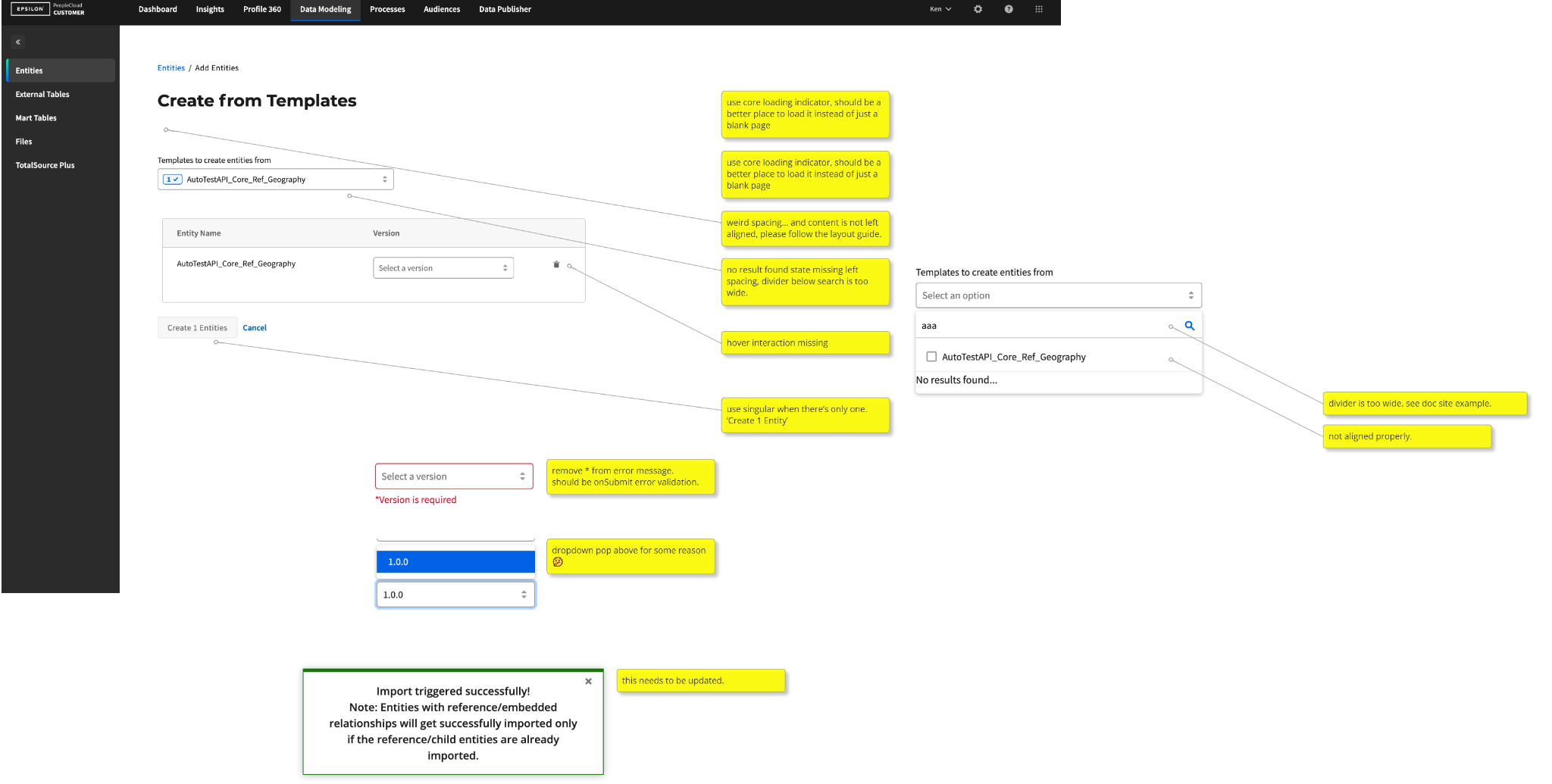
3.2 Workflow Rationalization for Entities and Profile 360
Identified redundancies and dead ends in workflows for core features like Entities and
Profile 360.
Proposed layout changes and navigation tweaks to minimize user
effort and streamline key tasks.
.png)
.png)
.png)
.png)
3.3 Persona Refresh to Match Self-Serve Goals
Worked with researchers to evolve personas based on the new business direction, shifting
focus from internal delivery teams to external users such as citizen data scientists and
data modelers.
Partnered with researchers to develop a focused research plan, connect with
subject matter experts and users, and observe real workflows through interviews and user
shadowing within EPCC.
3.4 New Feature: UX Collaboration
Designed for new features while also acting as a UXQA advocate, ensuring that what shipped met design intent and aligned with emerging standards.
.png)
.png)
4. Key Design System Works
4.1 EPCC Pattern Library
Created modular UI patterns and guidelines to standardize layout and reduce user confusion.
.png)
.png)
4.2 EPCC Writing Guidelines
Since the audit already covered UI and UX issues across all screens, it made sense to include the writing as well. This became the starting point for creating an EPCC Writing & Language Guideline (WLG), supported by screenshots of the actual guideline.
.png)
.png)
5. Outcomes & Reflection
5.1 What now?
| Area | Outcome |
|---|---|
| UX | Continued improving fragmented workflows like Entities and Profile 360, cleaned up navigation patterns, and reduced redundancy in task flows. |
| UXQA | Triaged over a dozen UXQA tickets I initiated, including layout misalignments and inconsistent spacing, and partnered with developers to address front-end gaps. |
| UI | Flagged screens with weak visual hierarchy (e.g., alert messages blending into forms), proposed changes using EPCC pattern guidance to increase clarity. |
| Research | Refocused efforts on interviewing internal delivery teams to validate pain points in onboarding and identify quick wins for workflow usability. |
5.2 Did We Solve the Problem?
Maybe, but I did what I could within my power.
While the complete transition to a sellable self-serve product was still in progress, we
laid down the groundwork for consistency, visual credibility, and user
confidence.
At one point, EPCC was being considered for sunsetting. That decision eventually
changed, and I’d like to think the improvements I contributed, such as usability, design
quality, and stronger internal alignment, helped influence that outcome.
5.3 Lessons Learned
- Design is only half the job: I realized how much time needs to be invested in managing, educating, and collaborating with stakeholders.
- Protect users from the backend: I became a more vigorous advocate for shielding users from technical complexity.
- Know the ecosystem: Familiarity with other Epsilon products would have helped me ramp up faster and align more effectively.